Oh Mother Where Art Thou?: An evening of music and poetry
Award-winning novelist and poetry aficionado Max Porter curated and compered this very special evening of poetry and music, exploring the ever-rich thematic territory of mothers – what it is to be one and what it is to have one.
A stellar line-up of contemporary poets performed their work- Emily Berry, Wayne Holloway-Smith, Rebecca Tamás and Mary-Jean Chan; with music from the most literary of lyricists, Kathryn Williams.
Read more: Oh Mother Where Art Thou?: An evening of music and poetry
On 23rd February 1944 The London Library came within a few feet of being totally destroyed.
The Library had had several near misses during air raids earlier in the war, but that February night its luck ran out. High explosive 500lb bombs dropped from a German plane recorded a line of destruction across St James’s – the first hit the Library, the last exploded in the road outside St. James’s Palace, blowing out ancient glass and destroying the windows of the Chapel Royal.
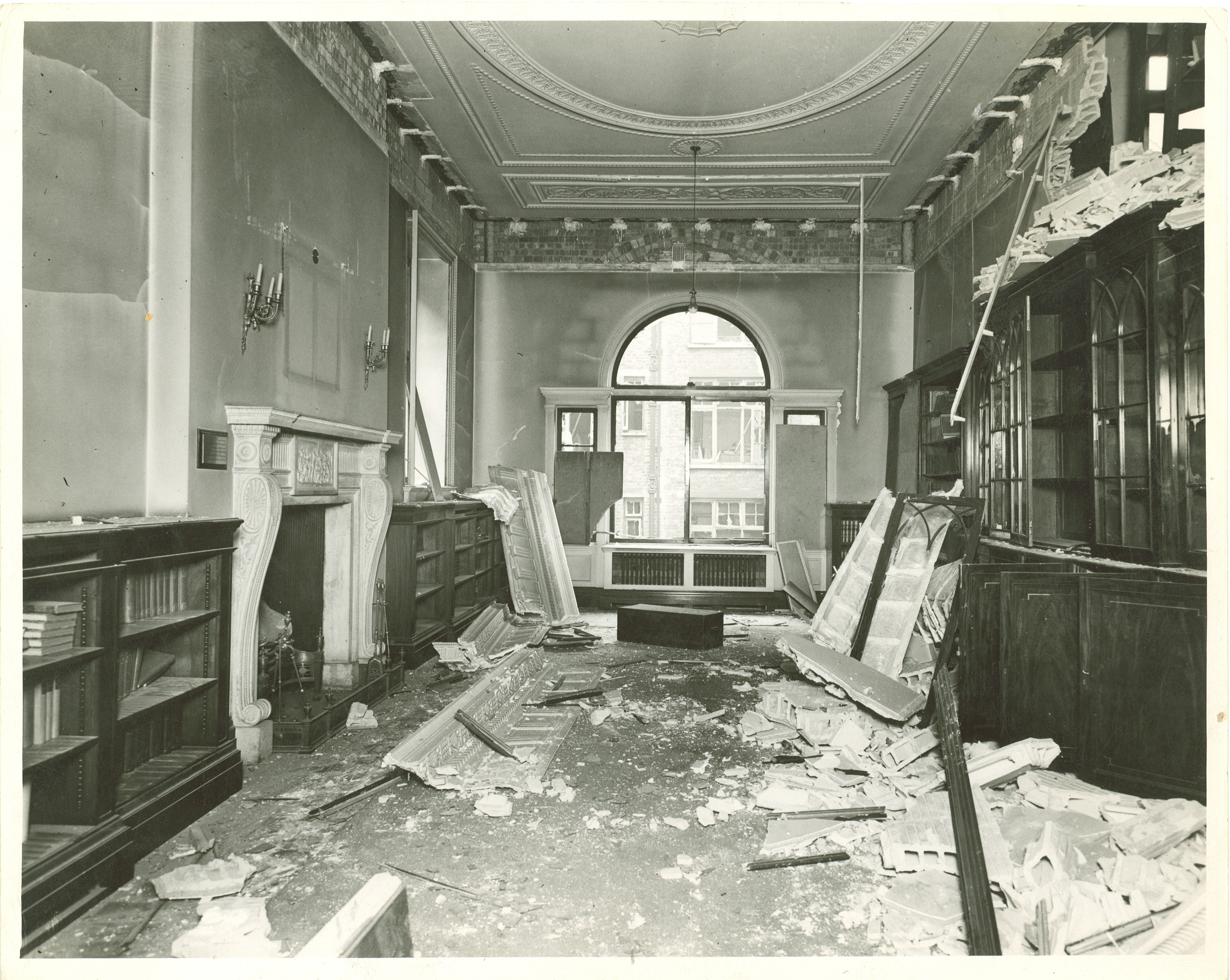
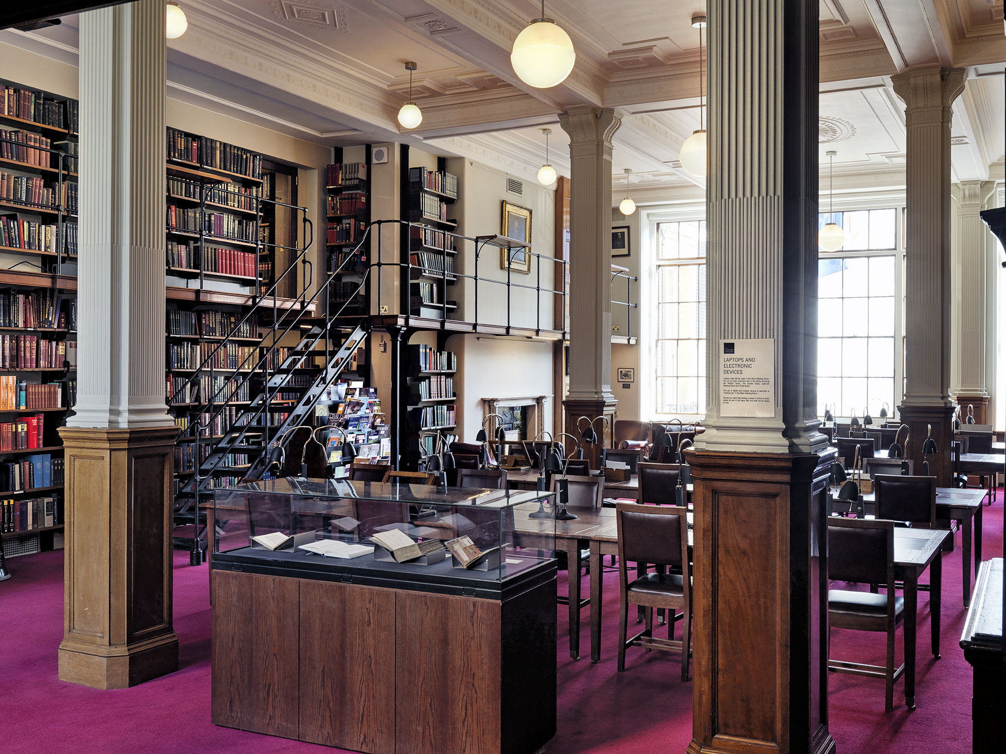
The Library’s Central stacks took a direct hit, severely damaging five floors of the recently built 1930s stacks plus parts of the Art Room, Prevost Room (now the Sackler Study), Issue Hall and the north bay of the main Reading Room (now the Writers’ Room). Photos of shattered windows and twisted girders provide stark evidence of the bomb’s impact.
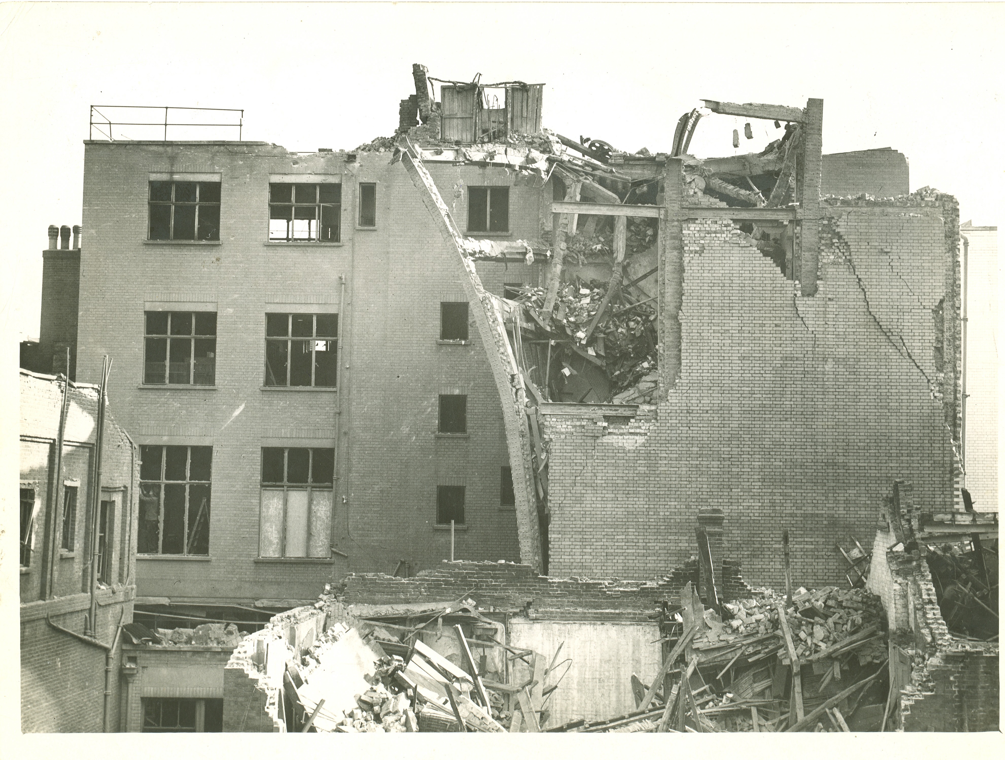
Had the bomb’s trajectory been a few feet shorter the Library would have sustained far worse damage than it actually did; had it been extended by a few feet the Library would have avoided damage altogether.
That said, the damage was severe. Over 16,000 books were destroyed and Library staff and members scrambled to save what they could before rain and fire hoses took their toll. Celebrated writers including James Lees-Milne and John Pope Hennessy helped in the rescue operation, at one stage reportedly holding the novelist Rose Macaulay out of the building by her ankles so she could rescue books. Anecdotal reports describe a member running downstairs from the Theology section - which had taken the brunt of the impact - shouting to the Assistant Librarian Frederick Cox that “We’ve lost our religion”!
Librarian James Purnell reported that “The old periodicals which were on the top floor suffered most damage, especially those with titles beginning with letters in the second half of the alphabet. There were also heavy losses in biographies of persons with names beginning with letters from G to J and from S to Z”.
UK and US Servicemen joined the clear-up operation and thousands of books were moved by wheelbarrow to be housed in the crypt of the National Gallery (where they remained for several months while the Library remained closed for loans).
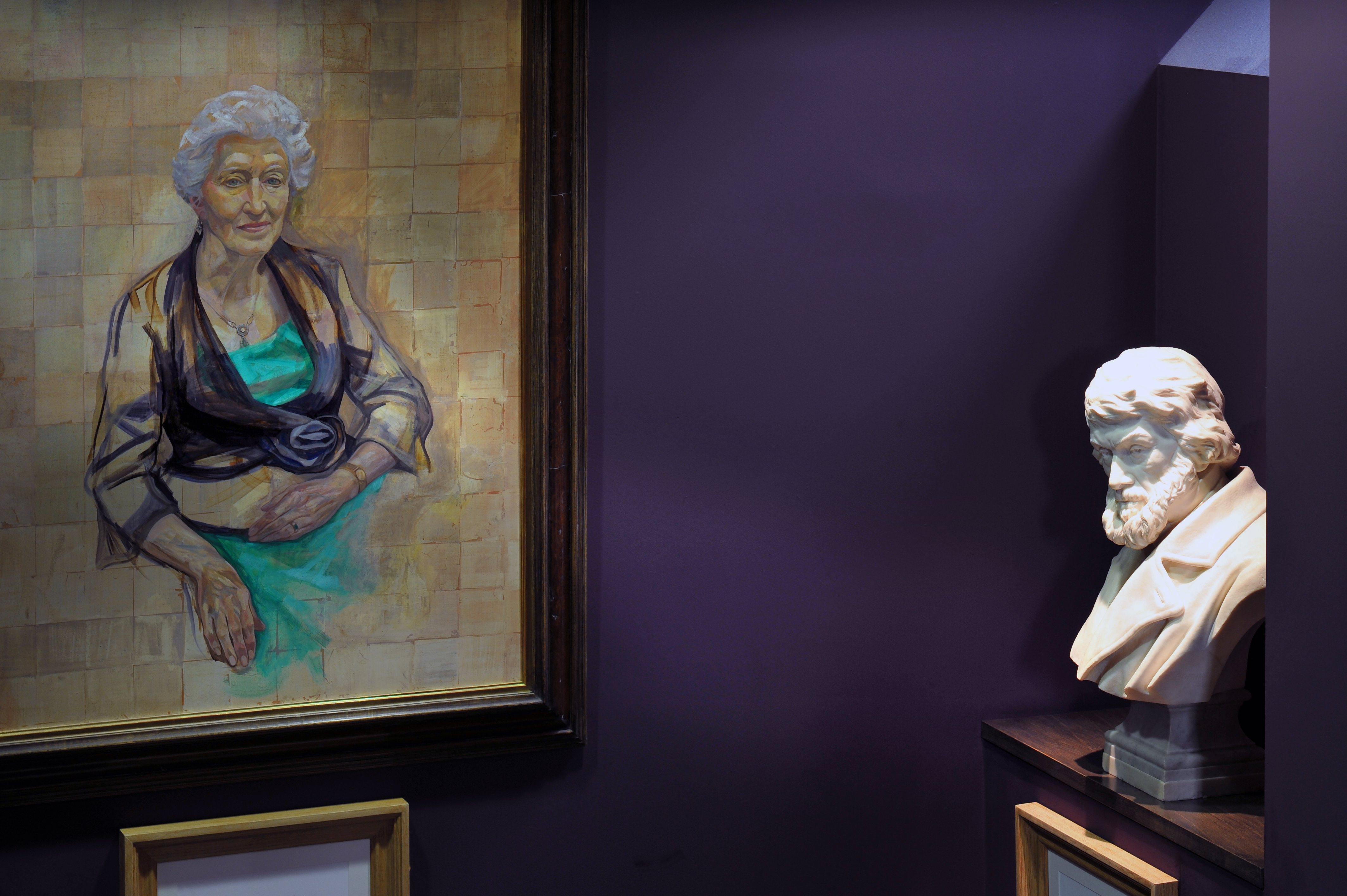
It was during the clean-up in the days following the raid that servicemen came across a particularly poignant symbol of the bomb’s impact. In the Art Room, lying amongst the rubble of books, bricks and girders, was the decapitated statue of the Library’s founder, Thomas Carlyle.
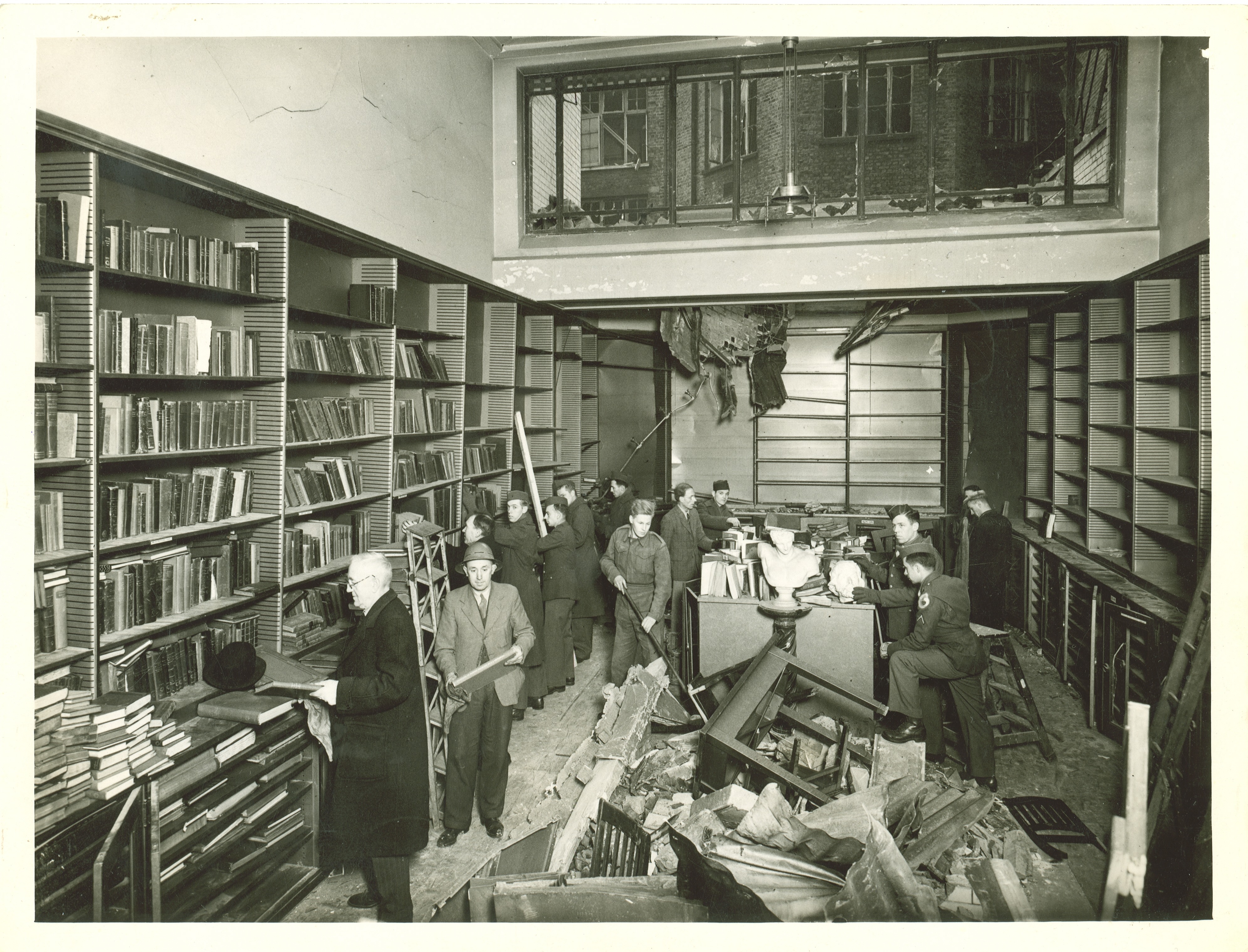
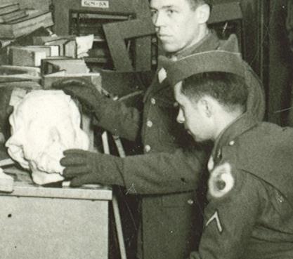
Thankfully the statue was subsequently repaired and Carlyle’s sombre countenance (sitting alongside the portrait of Valerie Eliot) now graces the landing outside the Art Room which nearly three quarters of a century ago had come so close to being destroyed.
Churchill's Ministry of Ungentlemanly Warfare
With Giles Milton
In this hugely entertaining and informative talk held at The London Library on 15th March 2018, historian Giles Milton - author of the best-selling book "Churchill's Ministry of Ungentlemanly Warfare" - reveals the secrets of Winston Churchill's inner circle of sabotage experts who planned some of the most audacious attacks of the Second World War.
Dunkirk - The History Behind the Motion Picture
With Joshua Levine
Historian Joshua Levine - author of the bestselling history of Dunkirk and historical advisor to the motion picture - joined us at The London Library for a fascinating talk where he revealed the real life story of one of wartime's most extraordinary operations.
 Latest News
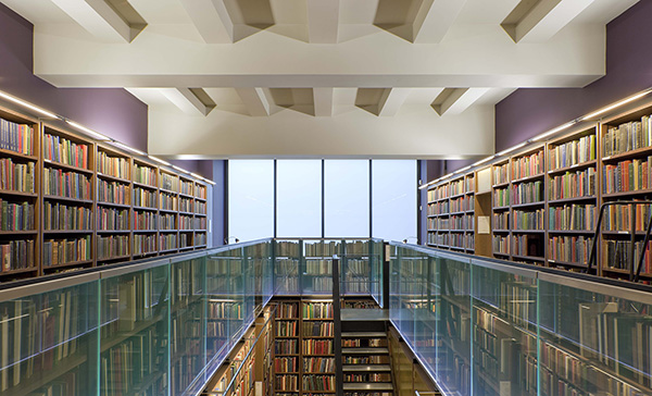 Inside The Library
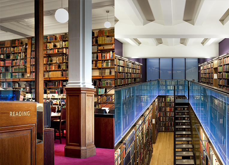
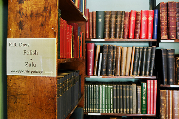 History of The London Library
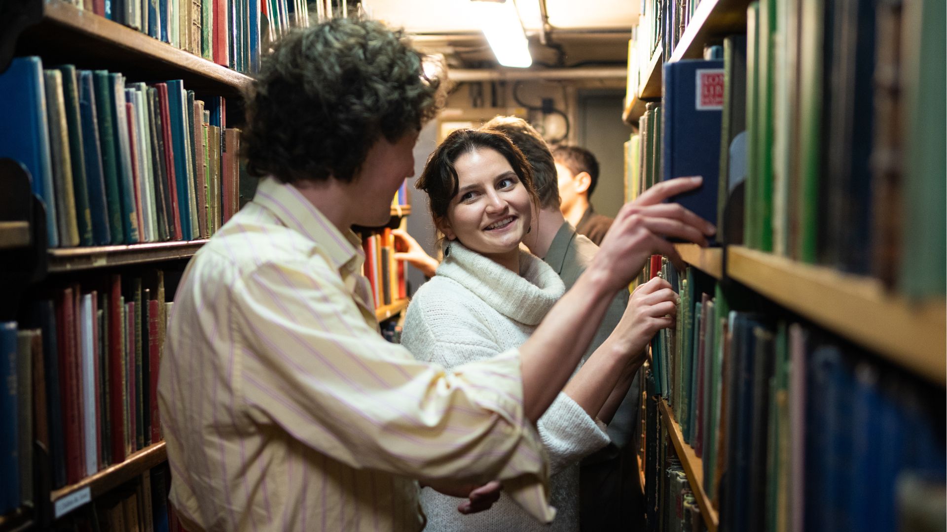 Public Tours
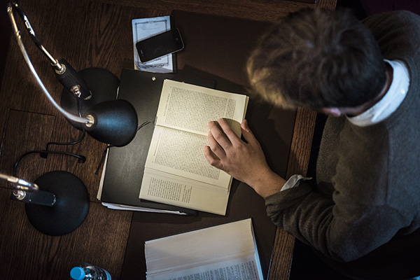 Members Past and Present
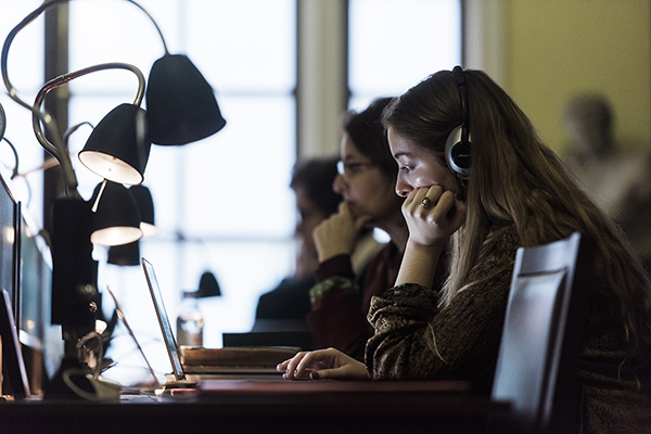 The London Library Team
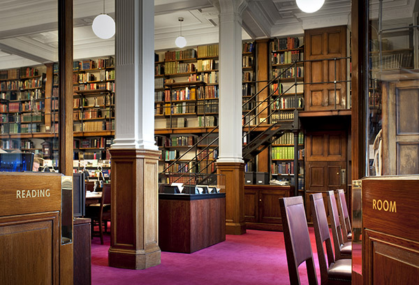 AGM and Annual Reports
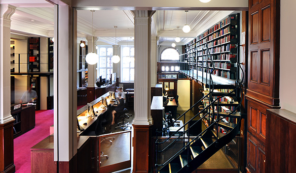 Patrons, Presidents and Trustees
 Emerging Writers Programme
 London Library Podcast
- London Library Partners
 London Library Ambassadors
- The Capital Campaign: Building Connections
 Subsidised Schools Membership Programme
- Shop