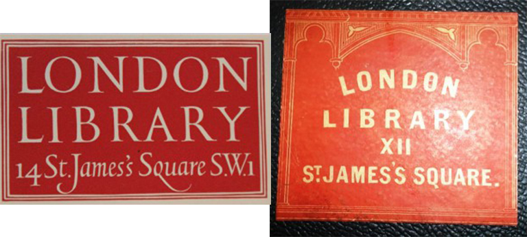
Left: Designed in 1951 Reynolds Stone’s London Library label is a timeless classic.
Right: One of the Library’s oldest Victorian book labels dates from 1845 and was used on folio volumes.
Designer, engraver and master letter cutter Reynolds Stone (1909-1979) is responsible for one of the Library’s most distinctive pieces of branding: the London Library book label (above left). Stone’s distinctive label has graced all the books acquired by the Library since 1951. The use of engraved or printed paper labels to mark the ownership of a book is almost as old as printing itself and Stone’s label is indicative of the Library’s rich cultural heritage.
A retrospective exhibition of Stone’s work at the V&A in 1982 showed just how prolific and exquisite his output was. He designed bookplates for writers, publishers and national institutions including the National Trust, the British Council and the Royal family. He engraved the Royal Arms for the coronation of King George VI and Queen Elizabeth II and provided engravings for numerous presses including the High House, Nonesuch, Gregynog and Golden Cockerell Press. His engravings were commissioned by Faber & Faber and the Folio Society and during the course of his career Stone illustrated works by Swinburne, Evelyn Waugh, Rupert Hart Davis, Herman Melville, Elizabeth Barrett Browning, Kenneth Clark, Benjamin Britten and Alfred Lord Tennyson. The quality of his work is neatly underscored in a telling collaboration with Iris Murdoch [The Year of Birds, 1978] in which Murdoch provided the poems in response to Stone’s original engravings. Stone’s work also included engraved devices for The Times in 1951; the Royal Coat of Arms for HMSO in 1955 and designs for the £5 and £10 notes for the Bank of England in the early 1960s. He taught himself to cut letters in stone and his mastery of the medium led to several nationally significant commissions including the memorials to Winston Churchill in 1965 and T.S. Eliot in 1966, both in Westminster Abbey. His astonishing body of work also includes the creation of two typefaces: Minerva for Linotype in 1954 and Janet in 1968. Stone and his wife Janet Clemence (1912-1998) were well networked in literary circles and entertained in their Dorset home, leading writers, painters and intellectuals including John Betjeman, J.B. Priestley, Benjamin Britten, Kenneth Clark, Henry Moore, Iris Murdoch and John Bayley – many of whom had close associations to the Library.
Stone’s London Library label is the latest in a continuum which began during the Victorian era. When viewed in their totality the Library’s highly crafted book labels pack a powerful historical punch. They not only mark ownership but transmit messages about the character of the Library and illuminate particular parts of the Library’s 175 year history. The oldest surviving labels date from 1845 (see image above right) when the Library made the move from temporary rooms at 49 Pall Mall to what was then 12 (not 14) St James’s Square. The red label gives the name and address of the Library within an architectural embellishment – a design feature which underlined the move to new premises. The label came in two sizes the larger more ornate for folio volumes, the smaller for 8vo and 4to volumes (See 1 below). The design of the smaller label remained in use (without a door number) until 1934. A much rarer green Victorian book label (Image 2 below) also survives which was used specifically for new books which could be borrowed for a fortnight only. This short loan label speaks strongly about the demand for new books during the era and the concomitant need to keep them circulating swiftly. At this time members were allowed one new book only at any one time.
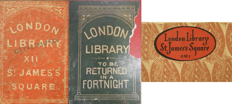
Left: Designed for 8vo and 4to volumes this book label was used between 1845 and 1934. The design was also blind embossed on bound periodicals.
Middle: A rare surviving Victorian short loan label for new books.
Right: Designed by a member of staff in 1934 the introduction of this label coincided with the opening of a major extension to the Library and the knighthood of the Librarian Charles Hagberg Wright.
The red Victorian book label remained in use until 1934 when a new oval shaped label was introduced (Image 3 above). Designed by a member of staff and printed in March 1934 it is perhaps not coincidental that the new oval label was printed just before the grand extension to the Library building was proudly unveiled in 1934. The new extension, designed by Mewes and Davis (architects of the nearby Ritz Hotel) included elegant statement rooms including the Art Room and 5 floors of book stacks. 1934 was also the year in which Hagberg Wright received a New Year Knighthood in recognition of his work as Librarian so the Library had a lot to celebrate. The oval 1930s label remained in use throughout the Second World War and its aftermath until it was replaced by Stone’s label in 1951, the year the Festival of Britain celebrated British contributions to science, technology, architecture and the arts. Printed in the Library’s Victorian colour palate of red and green Stone’s label gave absolute priority to the letter forms which stretch back beyond the Library’s Victorian roots to the Renaissance. In addition to these major book labels the Library occasionally produced ad hoc labels in recognition of specific gifts. A peacock blue label acknowledging a gift of 1400 books by Queen Mary in 1954 being one of the most eye catching.
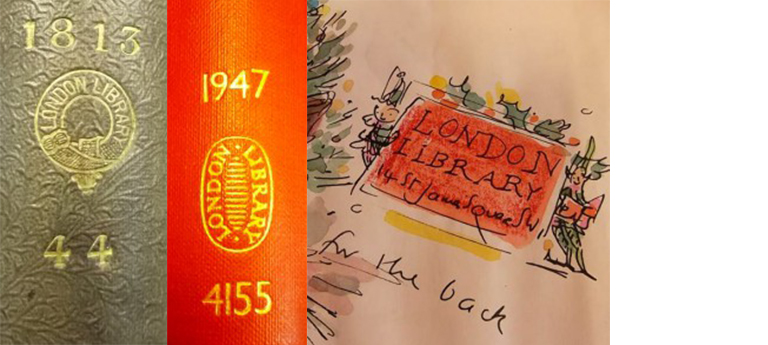
Left: An example of an early ornate gilt spine stamp which dates from the Library’s Victorian heyday.
Middle: Peter Waters’ 20th century redesign of the Library’s spine stamp references the grilled floors of the Victorian Back Stacks in its central horizontal lines.
Right: Reynolds Stone’s label illustrated by Charlotte Voake on a Christmas card design for the Library.
In tandem with its book labels the Library also employed ownership devices in the form of gilt spine stamps which it used from 1841 right up until the mid-1970s. The Victorian circular design (Image 1 above) was superseded only once by an oval 20th century design by Peter Waters (1930-2003) which referenced the grilled metal floors of the Victorian stacks in its centrally placed horizontal lines (Image 2 above).
That the Library’s iconography resonates in the modern consciousness is demonstrated in the English translation of Haruki Murakhami’s The Strange Library translated from the Japanese by Ted Goosen in 2014. The London Library is thanked in the picture acknowledgements for the rich treasury of illustrative matter it provided. From marbled end papers, mottled flyleaves, and even a London Library date label, the iconography of the Library is unmistakably present in this highly illustrated volume. Stone’s label received its own acknowledgement from the illustrator Charlotte Voake in one of his London Library Christmas card designs (Image 3 above).
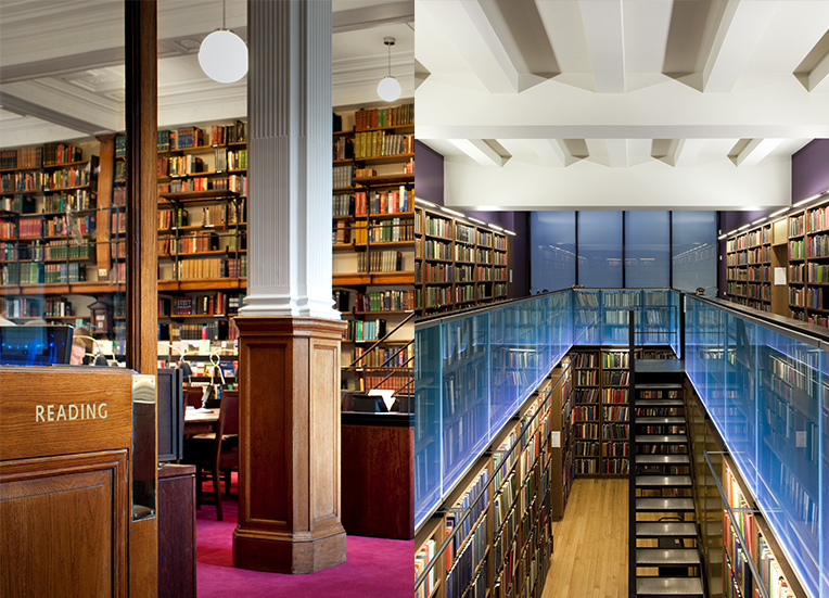
The London Library has outlived the great circulating libraries of the 19th century. Its book labels and spine stamps are distinctive and remarkably enduring features that connect the Library to its Victorian past. In their totality these small marks of institutional ownership tell the story of a library of subscribing members that has kept the book as its sole focus over three consecutive centuries.
Helen O’Neill
Previous Archive, Heritage & Development Librarian